The Fair has a longtime affiliation with the local transit commission, so we get a sweetheart deal on bus sides. Lord, I love bus sides.


This bus side ran in nearby Wisconsin, the Badger State. Minnesota is of course the Gopher State. If you know that, it's funny.
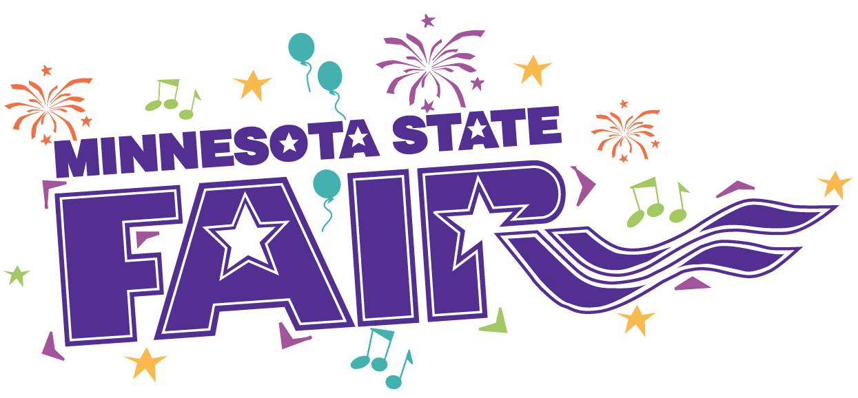
The Fair's existing logo, signage and architectural graphics were charming, iconic—and absolutely all over the place. We wanted to retain their essential spirit and character, but bring order to the madness.
The previous logo.
Another logo that appeared here and there.
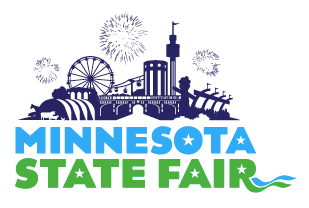
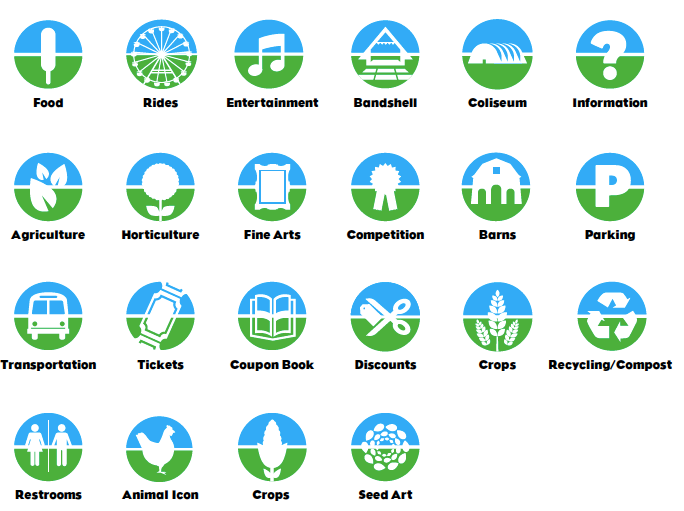
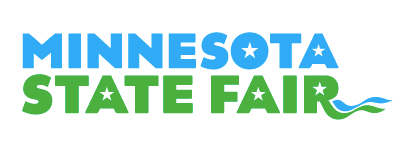
Below are elements of the new identity. As you can see, Replace kept the blue and green thing going, but cleaned it up a lot. The goal was to create an entire new design program—and have nobody know anything had changed. They tweaked the type a lot, created a couple of new characters, and played endlessly with the stars and ribbons until they were just right.